
Data Visualization Services
Transform complex business data into interactive dashboards and reports with data visualization consulting services. We create clear visual insights that improve reporting, business visibility, and faster decision-making.
- 100+Data Sources Connected
- 360°Business Visibility
- 70%Less Manual Reporting
- 4XFaster Insights
Key Takeaways
Clearer Business Insights: Turn complex datasets into intuitive visuals that make trends, risks, and opportunities easier to understand.
Real- Time Performance Visibility: Track KPIs, operational metrics, and business results through interactive dashboards and real-time reporting.
Scalable Reporting Systems: Support growing data volumes, users, cloud platforms, and reporting requirements without rebuilding the solution.
Data Visualization Consulting Services We Offer
Data Analytics and BI Reporting
Build reports and BI dashboards that organize operational, financial, and customer data into clear metrics for ongoing analysis.
Real-Time Data Visualization
Create live or near real-time dashboards that track KPIs, operational events, and changing performance across connected data sources.
Custom Dashboard Development
Design dashboards around your business goals, user roles, workflows, filters, and reporting requirements for a more relevant reporting experience.
Data Visualization Optimization
Improve existing dashboards by refining layouts, queries, calculations, and performance for clearer, faster, and more reliable reporting.
Data Storytelling
Structure charts, metrics, and supporting context into visual narratives that help teams understand trends, comparisons, risks, and results.
Cloud Data Visualization
Build scalable reporting solutions on AWS, Azure, and Google Cloud using native data, analytics, and business intelligence services.
Benefits of Data Visualization
Our Certifications




How We Build Reporting & Dashboard Solutions
Each project follows a structured process that connects business goals with reliable data and practical reporting. We start by gathering requirements and preparing data, before moving to dashboard design, validation, deployment, and optimization.
Assess Reporting Requirements
Our process begins by defining business goals, KPIs, audiences, and reporting workflows. These requirements establish the project scope, priorities, and success criteria.
Prepare and Model Data
With the reporting needs defined, relevant data is collected, cleaned, transformed, and modeled. This creates a reliable foundation for consistent calculations and accurate reporting.
Design Dashboards and Reports
Once the data is ready, dashboards and reports are designed around user roles, decision needs, and daily workflows. Charts, filters, and layouts are selected to make information clear and easy to explore.
Validate Reports and Metrics
Before deployment, calculations, business rules, filters, and dashboard behavior are tested against the agreed requirements. Validation confirms that the reporting is accurate, consistent, and usable.
Deploy and Optimize
After approval, the solution is deployed, integrated into existing workflows, and shared with users. Performance, usability, and reporting needs are reviewed after launch to guide targeted improvements.

Turn Data Into Actionable Insights
Discuss Your Data Visualization ProjectIndustries We Serve with Data Visualization Services
Healthcare
Improve visibility into patient care, operational performance, and resource planning through reporting dashboards.
Finance & Banking
Monitor financial performance, risk exposure, compliance metrics, and business KPIs through centralized reporting.
SaaS & Technology
Monitor product performance, customer engagement, and business growth through actionable insights.
Retail & Ecommerce
Analyze sales trends, customer behavior, inventory performance, and revenue drivers through interactive dashboards.
Operations & Supply Chain
Track logistics, fulfillment, and operational efficiency through centralized reporting environments.
Marketing & Advertising
Measure campaign effectiveness and marketing impact using performance dashboards and analytics.
Success Stories
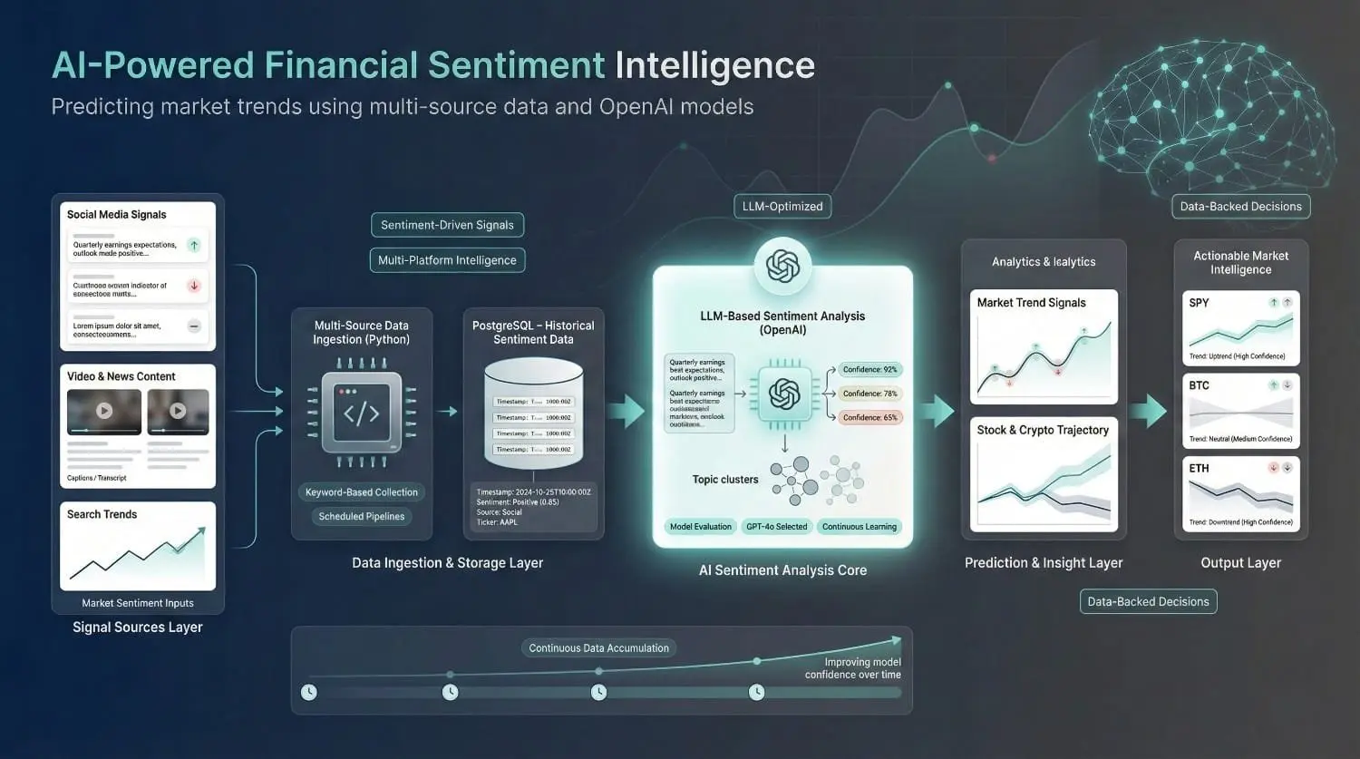
Financial Predictor using Sentiment Analysis via OpenAI API (for Maxx Source)
Maxx Source needed a sentiment analysis system for stocks and cryptocurrencies. DataPrism built a pipeline that gathered multi-platform data and used GPT-powered analysis to predict market trends.

Turning Real Estate Data Into Qualified Leads
Built a multi-source data pipeline to collect real estate agent information at scale while handling blocking and duplicate records. The result was a structured, reliable lead database that reduced manual prospecting.
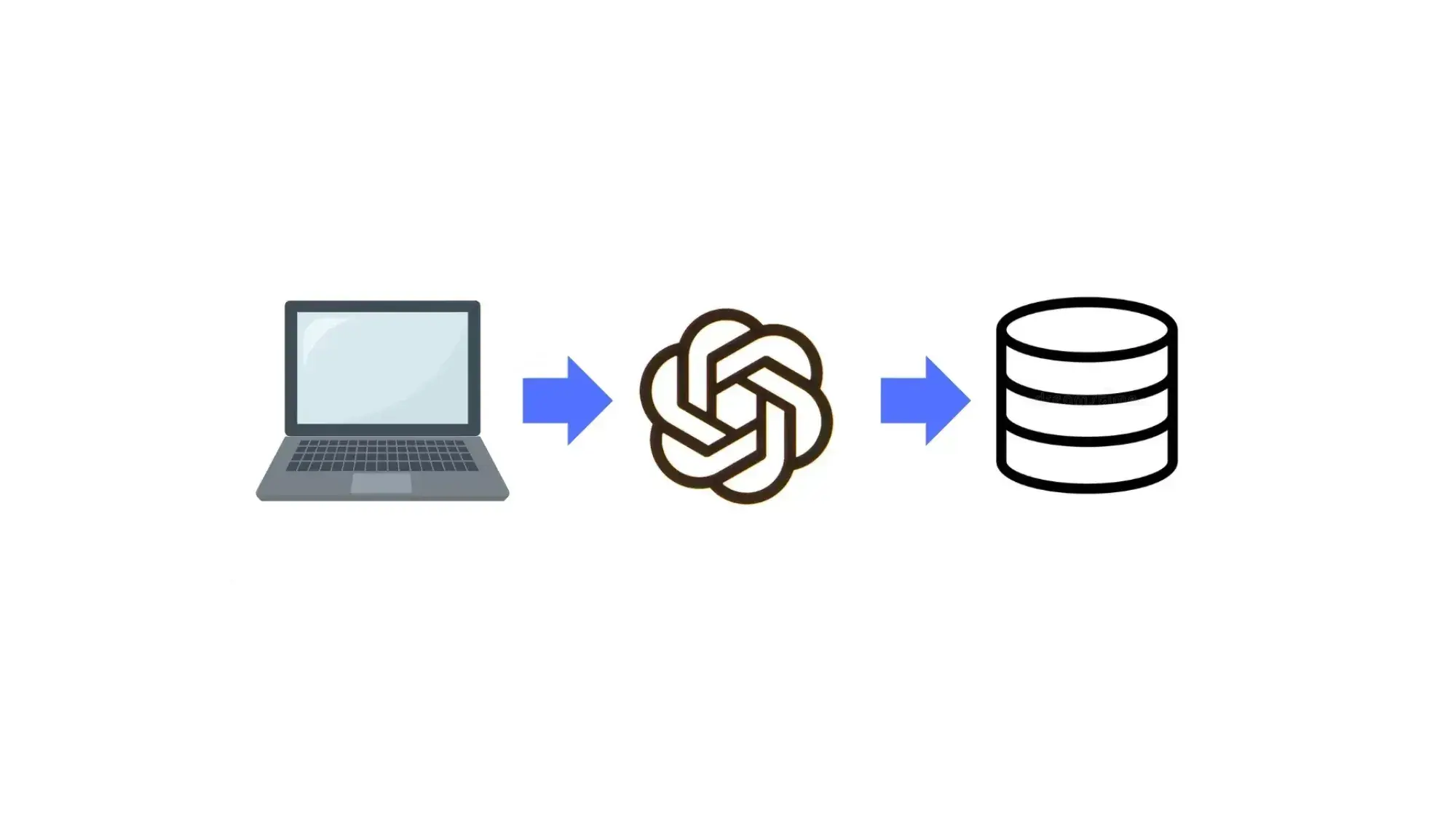
Natural Language Database Lookup System (dbGPT)
We created an intelligent lookup system (using the OpenAI) that can understand natural language prompts and convert them into SQL queries to retrieve the required information from a database.
Tools and Technologies
- bash
- Python
- MongoDB
- PostgreSQL
- SQL Server
- BigQuery
- Redshift
- Snowflake
- DBT
- Looker Studio
- Power BI
- Tableau
- AWS
- Azure
- GCP
- GraphQL
- Oauth
- Apache Airflow
Programming Languages
- bash
- Python
Why Choose Data Prism for Data Visualization
Choosing the right data visualization company for your business is critical and it requires much more than analyzing some fancy samples. We combine data engineering, business intelligence (BI), cloud analytics, and reporting governance to deliver clean and reliable dashboards.
Business-Focused Reporting
Dashboards lose value when they are built around available data instead of actual decisions. Our consultants define KPIs, users, and reporting workflows before designing the visual experience.
Data & Analytics Expertise
Reliable visualizations depend on accurate pipelines, models, and business logic. Our engineers combine data engineering and BI expertise to keep reports consistent, current, and trusted.
Scalable Dashboard Architecture
Reporting solutions can slow down as data volumes, users, and refresh demands increase. We design models, queries, and deployment patterns that maintain performance as usage grows.
Cloud Analytics Experience
Cloud reporting requires the right services, security controls, and integration patterns. Our team always builds visualization solutions on top of the existing architecture (across AWS, Azure, & GCP) to ensure maximum benefits.
Trusted Reporting Standards
Conflicting definitions and weak validation reduce confidence in dashboards. Data Prism establishes shared metrics, tested calculations, governance controls, and documented reporting logic.
Ongoing Reporting Support
Dashboard requirements change as KPIs, users, and data sources evolve. We provide performance reviews, enhancements, and targeted optimization to keep reporting useful and maintainable.
Our Clients












Frequently Asked Questions
Tell us about your project
Share your details and we'll reply within one business day.